

Overview
Today, volunteerism has become a widely-encouraged activity, not only for the benefit of the community but for the benefit of the volunteers themselves. Because countless people around the globe actively volunteer, many programs have been built that help people who want to volunteer find opportunities online. I set out to create a digital product that does just that, but instead of offering dozens of categories in volunteerism, Bridge focuses on a specific area of community service: addiction recovery support.
Initial Research
Through conducting preliminary research, I found that those in recovery are significantly more likely to avoid relapse when they are able to access support from their community. One study conducted in 2021 by the Pertanika Journal interviewed 18 participants who were in SUD (substance use disorders) recovery, and also volunteered to work as counselors for people in the same circumstances. They were asked what motivated them to make that decision. Another study from 2016 surveyed 50 people over 6 months as they attended peer-support events in their community. They found that "moderate or high attenders showed statistically significant improvements over time in internalized stigma, self-esteem-self-efficacy, and community activism-autonomy."
Personas
To better understand the user, I created 2 personas that represent Bridge's target audience, Maria and John. Each have different backgrounds, lifestyles, and motivations, but ultimately want to serve their community by supporting individuals in recovery.

Task Flow
Once I had my user personas ready to go, I walked through their possible experiences, pain points, and goals when using a volunteering app. This helped me create user flows for the project and organize my work into screens and actions. The user flow also allowed me to list out exactly what screens I needed to include and served as a reference throughout the process.

Competitor Analysis
Before beginning the brainstorming and organization steps, I analyzed 3 of Bridge's potential competitors: POINT, Deed, and Golden Volunteer. While doing research, I took notes about their strengths and weaknesses to find out where Bridge could solve current pain points for the users. I also studied what each of them were successful at, so that I can ensure the same positive experience for potential Bridge users.

Design System
To maintain visual consistency throughout the user experience -- both on the website and the mobile app -- I built a style guide and design system for Bridge that used color, typography, and other visual assets to communicate the brand in the right way.

Wireframes
Once I’d found the right solutions, I transitioned the paper wireframes into a digital, working prototype. This involved capturing responsive design considerations for desktop, tablet, and mobile screens. It also meant refining the low-fidelity wireframes for an optimal user flow followed by prototyping to create a seamless user journey.

Usability Testing
To test the accessibility and functionality of the mid-fidelity prototype, I conducted an unmoderated usability study with 8 participants. Each of them were directed to complete a list of tasks using the prototype that tested the onboarding, event sign-up, and resource flows.
Findings
Several key insights stood out from the usability test: - 6 / 8 participants said that not being able to view events as a guest was frustrating/disappointing. - 5 / 8 participants felt that the mobile app’s homepage did not give enough context about the events featured. - 3 / 8 participants said that some of the typography wasn’t large enough. 1 of them had a visual impairment and did not have an accessible experience on the app.
Feedback Iteration
Using my findings from the usability study, I worked to solve the key pain points that had come up with participants. Pain point #1: To fix the guest experience on the responsive website, I created a preview section of the landing page that users could move through while signed out. Instead of requiring visitors to sign in to see events, they were only required to do so before signing up for a specific event. Pain point #2: Participants said they needed more context about each event before navigating to the long-form details. To do this, I added key information (including the day and location of the event) to the cards on the home screen. Pain point #3: To ensure visual accessibility, I made the text larger (following Apple's Human Interface Guidelines) and invited the participant who pointed out the problem to test the improved experience.

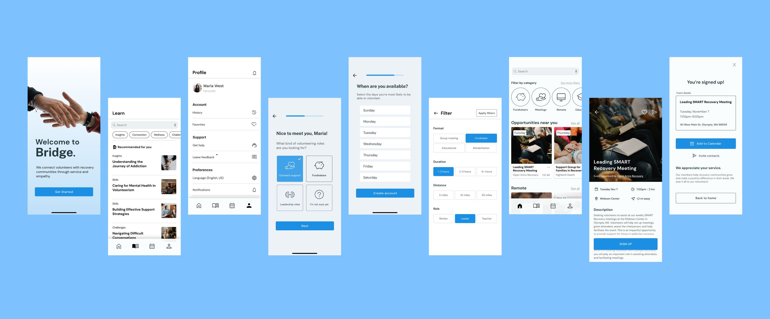
Interactive Prototype
After addressing the design concerns, I transitioned the mid-fidelity screens to a working high-fidelity prototype.
Reflection
Throughout this process, I’ve come to understand that organizations like Bridge are need to prioritize user-centric design to build their network (and thus help more people in need!). Having seamless navigation and quick user journeys helps encourage volunteers to participate in events for social good. It’s essential to create an experiences that thinks for the user and constantly anticipates their needs. Creating Bridge helped me recognize that the most important part of a designer’s job is to empathize with users on a deeper level. Stepping into their shoes to create solutions enables a better, more intuitive experience and thus a better relationship with the users.